by W.A. SteerĀĀPhD
![]()
by W.A. SteerĀĀPhD
| Back to contents | About... |
![]()
Consumer in-store and online digital photo printing services have recently become widely available. Being interested in both photography and imaging-systems, I generated a series of photographs and test-images to evaluate the services from a technical perspective. I got the files printed at several stores, and my detailed findings are presented on this page.
<<< INTRODUCTION (previous page) See previous page for information about the source images and an explanation of the test methodology and objectives.
| Jessops (Fuji Frontier) This was a very nice reproduction, but just a tad soft. |
 |
| Boots (Kodak Digital Photomaker) There is a distinct green cast on this image, but in its favour, it is slightly sharper than Jessops' (we'll reveal the catch below...). |
 |
| Tesco (Gretag Masterflex) A reasonable effort, although the blacks were less black, and the focus softer than Jessops'. |
 |
| PhotoMe kiosk Hmmm... green cast, poor contrast. Reasonably sharp though. |
 |
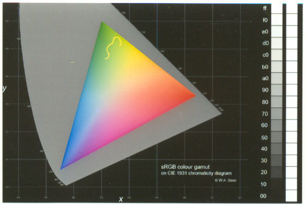
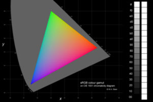 Originally devised in 1931, the the CIE chromaticity diagram is a graphical representation of the gamut
(or colour-space) of human vision. The horse-shoe shaped area (coloured grey on my diagram) encompasses
all human-percievable colours, being bounded on the curved edge by pure spectral (loosely 'rainbow')
colours - the colours you see when a CD or DVD catches the light. Any additive colour
reproduction system, such as a computer or television screen, based on three (e.g. red, green, blue) primaries
can show a triangular subset of the colours on the CIE diagram. The location of the corners of the triangle
are defined by the display primary colours. The colour system used in computer displays, graphics, and
most consumer digital cameras is (loosely) standardised in a system known as sRGB. More detailed information
on colour perception and reproduction can be found in my Introduction to
Colour Science elsewhere on this website.
Originally devised in 1931, the the CIE chromaticity diagram is a graphical representation of the gamut
(or colour-space) of human vision. The horse-shoe shaped area (coloured grey on my diagram) encompasses
all human-percievable colours, being bounded on the curved edge by pure spectral (loosely 'rainbow')
colours - the colours you see when a CD or DVD catches the light. Any additive colour
reproduction system, such as a computer or television screen, based on three (e.g. red, green, blue) primaries
can show a triangular subset of the colours on the CIE diagram. The location of the corners of the triangle
are defined by the display primary colours. The colour system used in computer displays, graphics, and
most consumer digital cameras is (loosely) standardised in a system known as sRGB. More detailed information
on colour perception and reproduction can be found in my Introduction to
Colour Science elsewhere on this website.
The colourful triangle in the graphic I created for this photo printing test represents the full gamut of colours available in sRGB colour-space. In principle, with the right equipment, the colours on the print could be measured absolutely and checked for accuracy. For the purposes of this study I was really just checking to see if it 'looked' right, and whether the colour transitions were smooth with no sudden jumps of saturation etc. In addition to the CIE diagram there is an additional 17-step greyscale (equally spaced in sRGB-luminance steps), useful to check the neutrality of grey, and also for 'crushing' of blacks or whites.
Note: the scans have lost some saturation, particularly in the red and green corners as compared to the actual prints. Use them only as a guide!
| Jessops (Fuji Frontier) Possibly slightly abrupt increase in saturation just inside the left-hand (green-blue) edge of the triangle, but otherwise looking good. Deep rich black background, and very well-defined crisp white text. Excellent greyscale range, and by far the most neutral grey of the bunch |
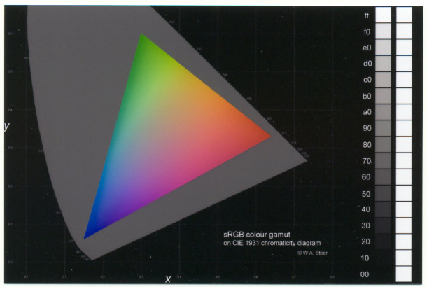 |
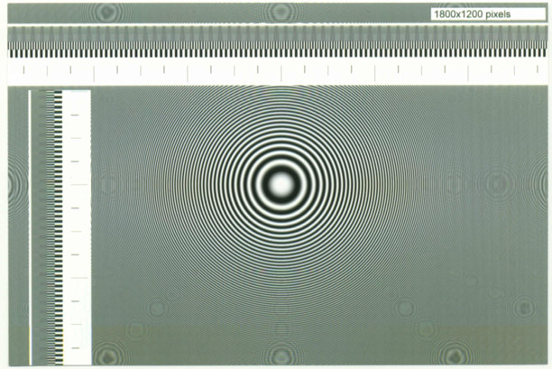
| Boots (Kodak Digital Photomaker) The green corner seemed a bit under-saturated, and the cyan a little too vivid, but very smooth colour transitions. The text (and edges of the greyscale) show chromatic aberations (yellowy-orange fringing), and the greyscale has an overall greeny-yellowy cast. |
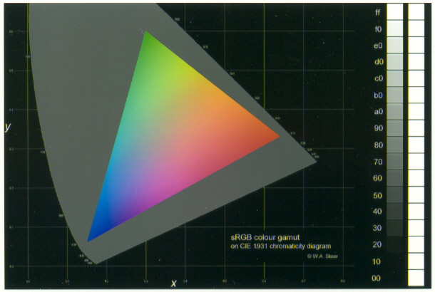 |
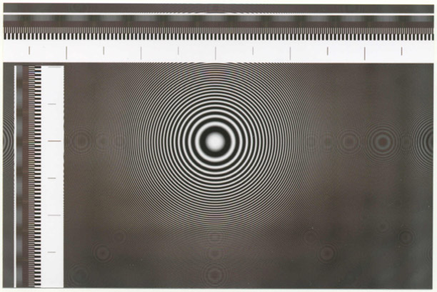
| Tesco (Gretag Masterflex) A very respectable-looking colour triangle, but the text and fine-lines are dark browny and indistinct. The greyscale is reasonably neutral, if anything, curiously, very-slighty steely-blue. |
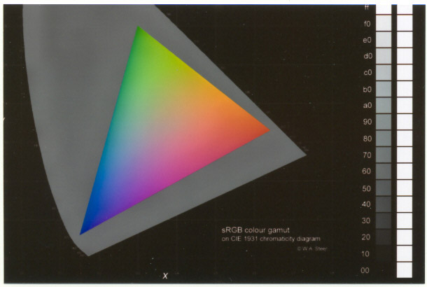 |
| PhotoMe kiosk Somewhat abrupt colour transitions, and visible white 'Y', and generally desaturated - especially in the blue/magenta region)... which is hardly surprising given the greyscale maxes out at about the fourth box from the top. The black background is also anything but. In its favour the text and fine lines are white and repectably sharp (though slightly short of Jessops'). Oh yes, and there was obviously crud all over it while it was being exposed and developed! |
 |
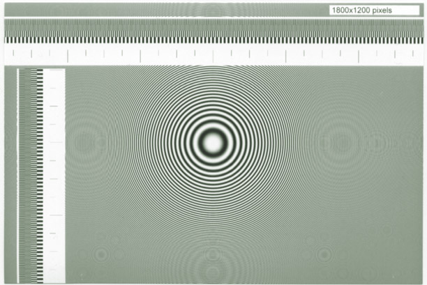
The test comprises a zoneplate (the bullseye and concentric rings) which is a special pattern which sweeps through all possible horizontal and vertical spatial frequencies. This test can reveal all sorts of spatial (sharpening/softening/resizing) artifacts, and particularly tends to expose simplistic (low quality) scaling (image resizing) algorithms. Additionally, this test image also contains 'rulers' - markers at 75, 150, 300 pixel intervals, which (at 300dpi) should appear at quarter-, half- and one-inch intervals. Adjacent to the rulers are further on-off pixel patterns designed to stimulate Moire effects and help quantify any scaling performed.
By their very nature, zoneplate images can be difficult to reproduce accurately. I have taken extreme care in the scanning, filtering, scaling, and JPEG compression, to produce the following reproductions which I hereby certify are 'true likenesses' of the various prints, subject to the 100dpi-equivalent image-resolution for the web. (Only disclaimer: the slight colour-interference in the rings just beneath the horizontal 'ruler' near the centre of the print are an artifact of my scanning process.)
| Jessops (Fuji Frontier)
Beautifully clean zoneplate! Indicates high-quality resampling/scaling algorithms. | 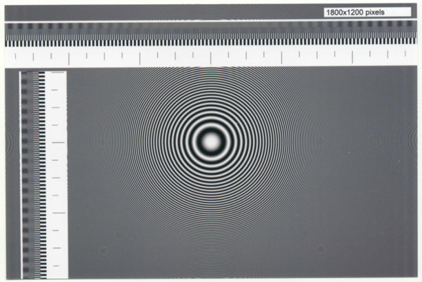 |
| Boots (Kodak Digital Photomaker) A fair crop of rogue-rings there, and rather worryingly, the ones along the top and bottom edges are not even circular! Greeny overall cast. The orangey-brown stripe along the bottom is real; it seems to be a chromatic/spatial aberation rather than a simple dye smudge. |
 |
| Tesco (Gretag Masterflex) Yuck! Blurry. Brown. Blotchy. Rogue-rings galore. Ok, it's not entirely fair, it seems their printer is substantially less than 300dpi, probably more like 250dpi. But even so, this result is not at all good. |
 |
| PhotoMe kiosk [The PhotoMe wouldn't recognise TIFFs, so I had to go away and put a BMP version on my CD. Consequently the print was scanned in a different session to the rest.] An unfortunate crop of rogue rings. And that green cast. |
 |
| Jessops
The sheer precision of the black and white blocks is testament to the quality of the underlying printer engine. Moire patterns in the row of finest bars, caused by resampling/scaling, have approximately 7 cycles per inch and, in conjunction with a simple ruler-measurement, show that the image has been scaled up by ~7 parts in 300 (102.33%). The Moire pattern appears to have a 'sinusoidal envelope', indicating a high-quality bitmap scaling algorithm - probably involving polyphase filters. Despite their original pitch of less than 3 pixels, the curved/diagonal stripes from the zoneplate are also well-defined. The only surprise and disappointment in this test can be seen in the full image; the Moire beats fade out and the fine lines cease to be resolved at all towards the horizontal centre of the image. This raised the suspicion, since confirmed, that images undergo two, cascaded resampling operations; the first scales the source to the nominal 6x4" @300dpi, then a second applies the 2.3% enlargement to bleed the image off the edge of the paper. A single resampling step would cause less loss of image sharpness. | 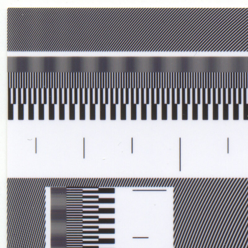 |
| Boots (Kodak)
The black and white blocks are much less clear, and have particularly distinct vertical blurring. I can only guess that this may be a limitation of the printing engine, or poor maintenance of it. Looking to the row of finest vertical bars, it is noteworthy that the resampling/scaling has caused small isolated bands of blurring, rather than smooth sinusoidal true-Moire patterns. This is indicative of a lower quality, possibly 'linear' or 'bi-cubic', scaling algorithm. Scaling is ~10 parts in 300 (103.33%). The fine curved/diagonal stripes from the zoneplate are wobbly; I'm not certain of the cause, but it appears to be related to the non-circular rogue rings in the zoneplate and may be a scaling artifact. | 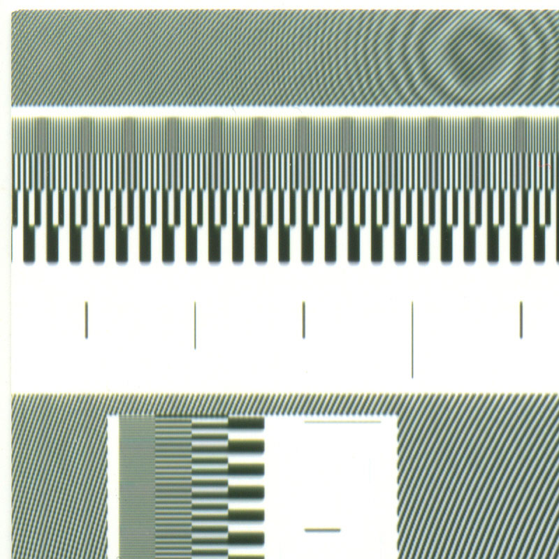 |
| Tesco
The black and white blocks are reasonably clear, but the black seems to have 'spread' (with neat rounded corners!) into the white - resulting in the net darkening of fine-line patterns. This could be a limitation of the printer engine, or an indication that it needs some maintenance (focussing?). Looking closer, the 'spreading' seems to be slightly red-brown tinged and the origin of the overall brown cast on much of the zoneplate. The finest vertical bars have not been resolved at all, but if the printer resolution is only 250dpi, that's fair enough. It is interesting that the bars have been replaced by a smoothly varying (ok, stepped-smooth) grey bar; this may indicate a modest attempt at a high-quality polyphase resampling filter - but source images closer to the native resolution are really needed to be sure. Measuring the 'ruler', which is less precise than studying Moire beats, shows an overall scaling around 104.33%. | 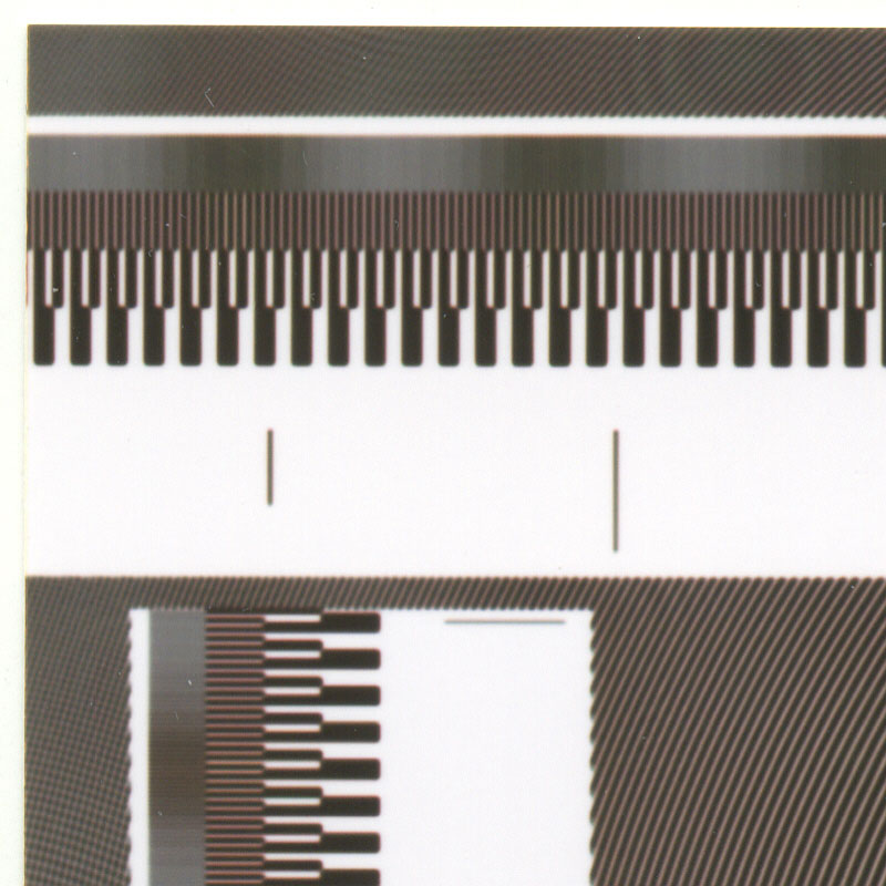 |
| PhotoMe
[Printed from a .BMP file, and scanned on a separate occasion to the rest of the images in this group.] The overall 'style' of the image from this printing engine is very similar to Boots', with a tendancy towards a green hue, and similar sharpness and vertical blurring. The resampling is markedly different; finest moire lines have been resolved, of sorts, but with lines of varying weights (thickness). This is consistent with the much higher resolution (692dpi) claimed on the PhotoMe website, but implies a very crude up-scaling/resampling algorithm. The image-enlargement cannot be measured accurately by Moire, but from the 'rulers' measures at 104.54% (short edge), and 103.70% (long edge). The horizontal and vertical scale is not exactly the same! (Presumably for the same reason, the nature of the beat patterns in the finest moire rulings also differ in the two axis.) | 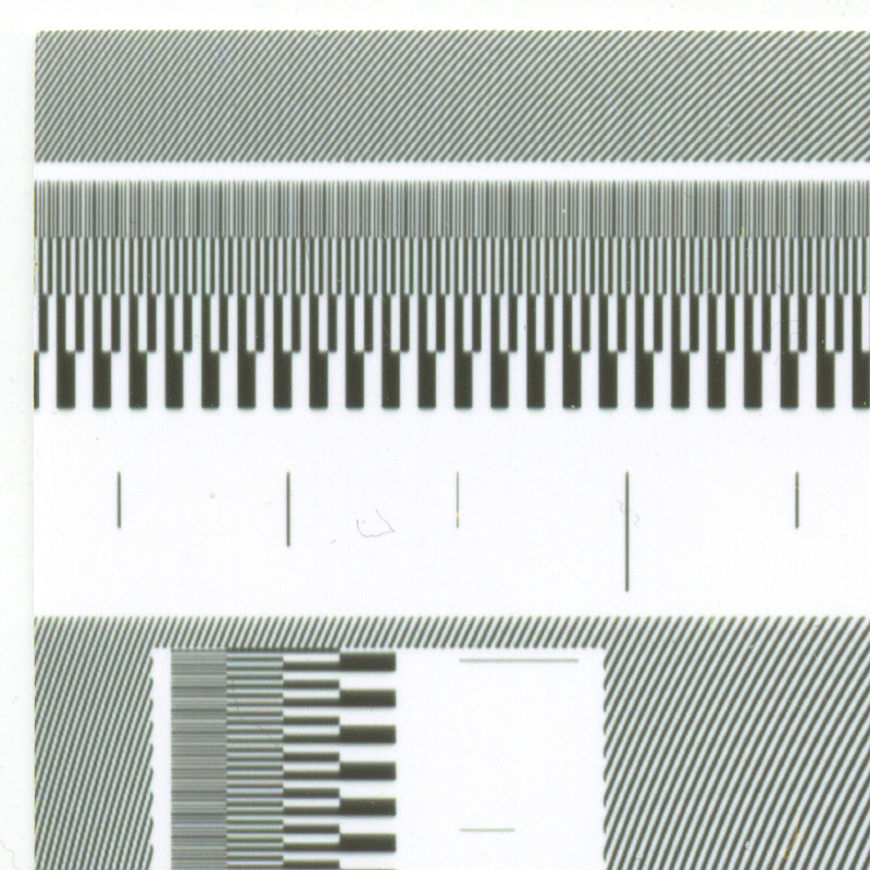 |
Appearance of prints from different shops did differ significantly and proves, among other things, that although sRGB colour-space is supposed to be a standard, in practice the actual interpretation you get varies!
Unsurprisingly from this sample, the prints from Jessops come out top. Neutral greys, nice full contrast range, colours which are a remarkably good match to my screen. Test-patterns reveal that the Fuji Frontier is a very capable printing engine; the one in this store is less than 6 months old, and evidently well-maintained. I'm still disappointed in the two-stage resampling/scaling in the digital chain of Jessops' setup, which causes an extra stage of blurring as well as ruling out any hope of 1:1 pixel prints. Revisiting Jessops 8 days later produced a second set of prints indistinguishable from the first set, so reproducablity looks good. On another visit however, with a stand-in operator in-store, my Jessops prints of black-and-white pictures were returned with mildly greeny-tinged greys, and possibly slightly darker than usual...
Both the Boots and PhotoMe machines were stand-alone kiosks and are clearly in a lower class than a full-blown (behind-the-counter) mini-lab machine. They both had an objectionable greeny cast, and give marginally sharper photographs than Jessop's setup, but their cruder scaling algorithms result in 'crinkly' diagonals and risk other aliassing artifacts.
Tesco's Gretag MasterFlex is a mini-lab machine, but lower resolution than the Fuji. The colour reproduction was fair, though the blacks were muddy, and images were the softest focussed of those tested. Its older technology and/or poorer maintainance and non-specialist operators may go some way to explaining its results.
Other Frontier prints of simulated colour spectra (from both Jessops and PhotoBox) show an unnatural increase in saturation of pastel green colours compared to the sRGB specification. I have to wonder whether this is a design 'fault', or just part of Fuji's style - their 'trademark'! Then again, since the green primary of (sRGB) computers and televisions is poorly saturated, some kind of a 'hack' may inevitably required in a photo-printer to allow the user a chance of obtaining a colour anywhere near the maximum green the printer is actually capable of! Perhaps this artifact is a side-effect of that?
In March 2006 I visited a Photo-Me service base and saw inside their kiosks - their thermal printers are made by Mitsubishi, and apparently the 'vertical blurring' I noticed (on both the Photo-Me and Kodak kiosks) is a known issue with thermal printing technology. Apparently in high-speed prints the head does not have time to cool down properly as the image is made, resulting in blacks smearing into whites in the direction of travel of the paper on abrupt edges! On the same visit I was able to see the Photo-Me/Kis/Kodak DKS1550 mini-lab machine, get some idea of the operators' user-interface, look inside the machine, and make some prints. In contrast to the Fuji Frontier which uses a laser scanning system to expose the photographic paper, the DKS1550 uses a halogen lamp and LCD exposure system, making it a bit more like a traditional enlarger. My gut engineering feeling is that the laser exposure system is a nicer approach and more easily scalable to larger print sizes, but the LCD system seems quite capable and I'm assured that it's much cheaper and less prone to breakdowns!
©2005-2006 William Andrew Steer