by W.A. SteerĀĀPhD
![]()
by W.A. SteerĀĀPhD
| Back to contents | About... |
![]()
Anyone who has tried to reproduce a realistic-looking "rainbow" spectrum either photographically, in print, or on a computer screen will have found that this is not trivial. Even if done properly using the principles of colour science, problems still result owing to the limited colour gamut of the display-device. This page illustrates the problem and shows some possible work-arounds.
Figure (a) shows a "spectra" graphic where negative-going RGB values have been clipped to zero. The red/green/blue traces show the (non-clipped, linear-light) RGB device components. Note the negative lobes, particularly of the red channel between the 460 and 550nm part of the simulation. The blue-green part of the spectra does not appear particularly convincing.
In Figure (b) I have added a uniform amount of white across the entire spectra, sufficient to lift all but the red component out of the negative. This graphic looks much more believable, like you'd see if you projected a real spectra onto a piece of paper, but had a certain amount of ambient white light in the room. Technically though, the colour is still wrong between about 480 and 550nm.
Figure (c) uses the same basic white addition as (b), but dynamically lifts the white as required in the turquoise part of the spectra so that the correct hue may be shown. The non-preservation of luminance makes this a bad way to deal with out-of-gamut colours, but does show just how far out-of-gamut saturated turquoises lie.
Figure (d) is similar to (c), but preserves the luminance in the region of dynamic white addition.
In figure (e) the entire spectra is uniformly, and heavily desaturated by white-addition, to keep all the components positive, and reproduce the correct hues. It is the most realistic-looking spectra (matches my recollection of experiments with prisms and light-sources), though the saturation (or photographers' "contrast") leaves a lot to be desired!
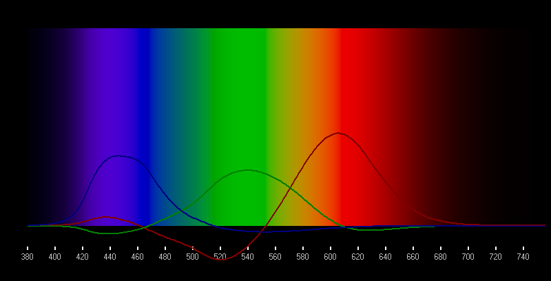
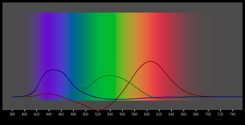
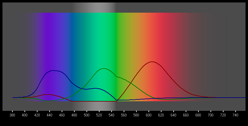
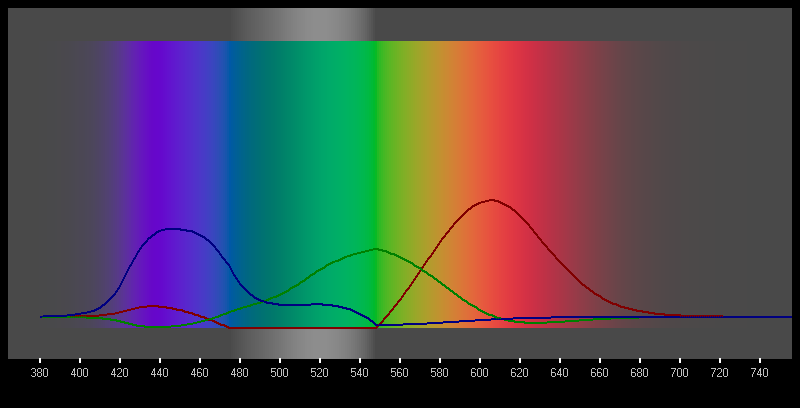
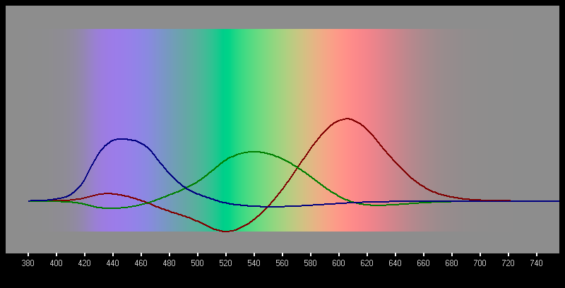
Figure (e) is the only one which is a technically accurate reproduction of a real spectrum, albeit with a large amount of background white. For an artistic/aesthetic graphic something like figure (d) may be a good compromise, being based upon figure (c) but with the original luminance maintained despite the extra desaturation between 480 and 550nm. Since out-of-gamut colours cannot be reproduced on a display, the choice of "fudge" used ultimately boils down to an artistic one. In real pictures of natural scenes, highly saturated colours are fortunately rarely encounted.
©2004 William Andrew Steer