by W.A. SteerĀĀPhD
![]()
by W.A. SteerĀĀPhD
| Back to contents | About... |
![]()
You see many examples of badly-plotted (severely chromatically inaccurate) CIE chromaticity diagrams. This page shows what goes wrong, and why!
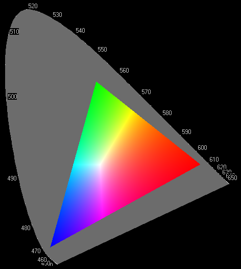 | 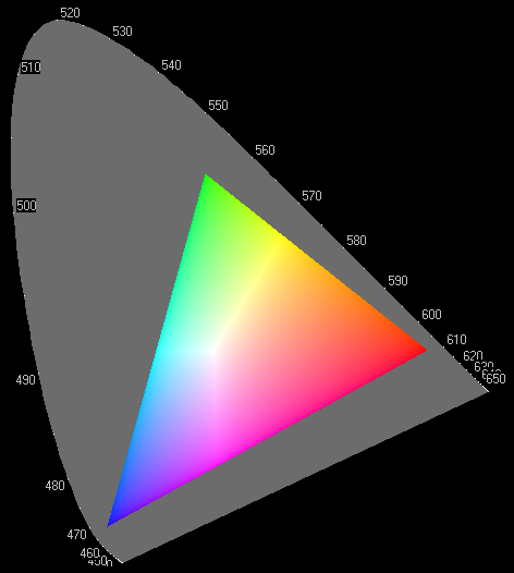 |
| This is perhaps the worst you'll see! In order to get the most brightness across the plot, per-pixel RGB have been scaled up so that the greatest of the three always equals 255, leading to the ghastly and misleading bright-Y artifact. Furthermore, the gamma-mapping of the display has been ignored - the RGB values naively being treated as if linear in light. | As left, but at least gamma has been treated properly. |
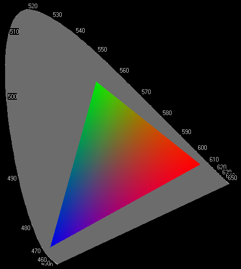 |  |
| This doesn't use the RGBmax trick (the blue and green vertices are less than full brightness), but still has ignored the effect of display gamma. | This image is technically correct, has the correct gamma, and is also free of the nasty bright-Y artifact. It is a bit dull however, as no alternative enhancement has been made to get the maximum brightness from the green and blue corners of the triangle. |
And finally: this is my version, with correct sRGB gamma, and a linear luminance enhancement to get the green and blue corners to full-brightness for greatest appeal:
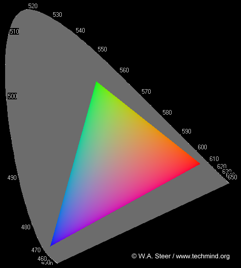
©2004 William Andrew Steer